Dynamic typeface
For the Generative Photography project I used basic patterns created with Processing. I thought it would be interesting to capture words with the same technique, so they would appear ‘broken’ depending on the framerate, and thus, difficult to read. I started seeking this effect projecting words with Processing – glitches didn’t appear when using regular typography, probably because the way is rendered is different than basic shapes (rectangle, ellipse, etc.)
I created a typography based on squares, so each character can fit in a 3×5 matrix, inspired on MiniML fonts by Craig Kroeger. I adapted some characters to make them fit into the 3×5 – ‘M’ and ‘W’ characters look a bit weird in such a small container but are still recognizable.
After coding the typo in processing to be generated parametrically, I was appealed by the aesthetics of the characters being overlapped with some transparency. The resulting symbols using negative tracking define a visual code or identity for each word.
It’s also interesting to think about these symbols as a way to encrypt information. I haven’t spent time thinking on how many words (from the English dictionary, say) could a single symbol represent.
It might be relatively easy to extract which characters are inside each symbol although it doesn’t have any information about the sequence, so anagrams are not distinguishable – ‘LISTEN’ and ‘SILENT’ look the same on the most compressed symbol.
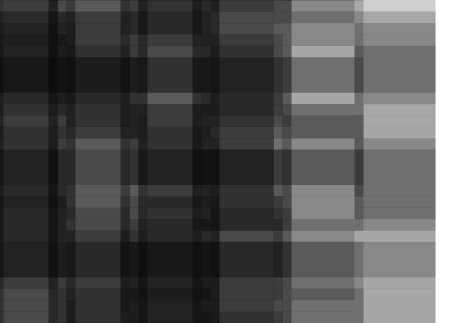
It starts being more complicated (and beautiful) when the letter-spacing is not multiple of the pixel size, creating interesting patterns and shades of grey.
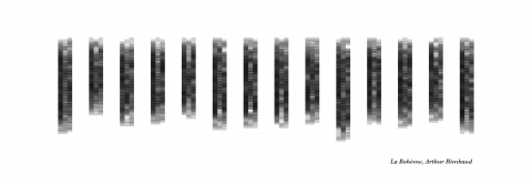
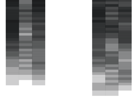
Using this idea I took the poem “Ma Bohème” by Arthur Rimbaud and I distributed each line vertically. These are two different layouts using different spacing.
These are two close-ups of the images above, I really like to think that this apparent randomness have a meaning behind.
I wanted to capture the dynamism of using this typography while morphing from one position to another – I did this small experiment using the same poem, this time with horizontal arrangement so is easier to distinguish the text. The poem is recited by a french virtual lady (i.e. text-to-speech):
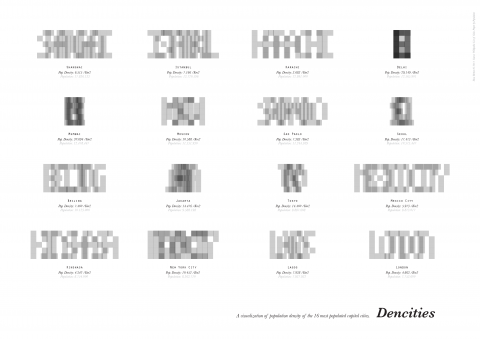
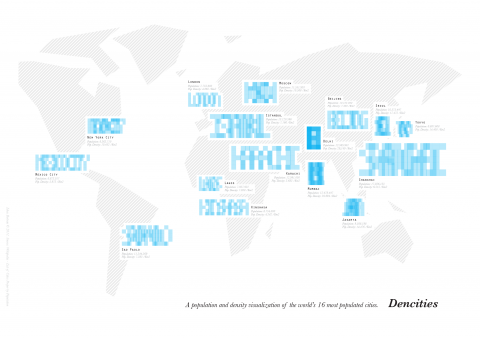
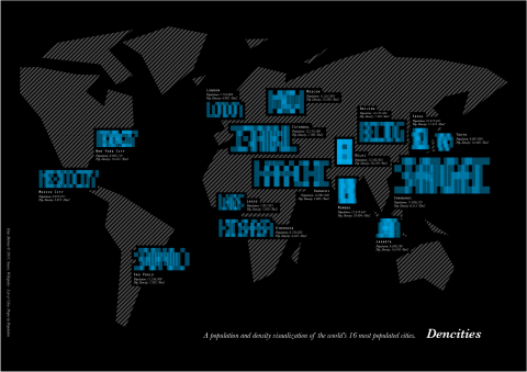
Separately, I thought about using the property of the typo to shrink for visualizing the population density of the world’s 16 most populated cities. The more dense is a city (population / km2), the more compressed are the characters.
I’m not completely convinced about it since the appearance of the symbols not only depends on the population density but also on how long is the name of the city. What is true (and taking the meaning of density literally) is that the density of the symbols change according to the population density – amount of black / cm2, for example. Is not strictly comparable from one city to another since the name length is not the same, but the grey intensity together with the level of legibility gives a sense of density.
While comparing different cities, the population density lacks some meaning without the population number. In the following poster each city symbol contains information about the population (using the font size, linear relationship) and the population density (using letter-spacing, Dens^2+Dens+A relationship; letter-spacing being relative to the font size).
White version:
Black version:
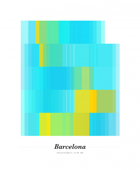
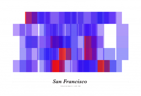
In parallel I made some tests adding color. These are samples using different ‘densities’ and color patterns:
Using the population parameter, I created some posters for other cities. Here the ones from the two cities I was visiting in the moment of doing these experiments:
There has been a slight deviation from the first purpose of that dynamic font and the experiments shown above – I’ll come back to the photography path some day.
Tags: dynamic, map, poem, processing, typeface, typography, visualization

