Archive for the ‘thoughts’ Category
Point & Press
Saturday, February 13th, 2016“Today I’ve used my phone to check how long until the bus arrived at my stop. I’ve also used my phone to control the volume of my speakers at home, to learn more about a restaurant before getting inside, and to send a photo I took with my friend to his phone, next to mine.”
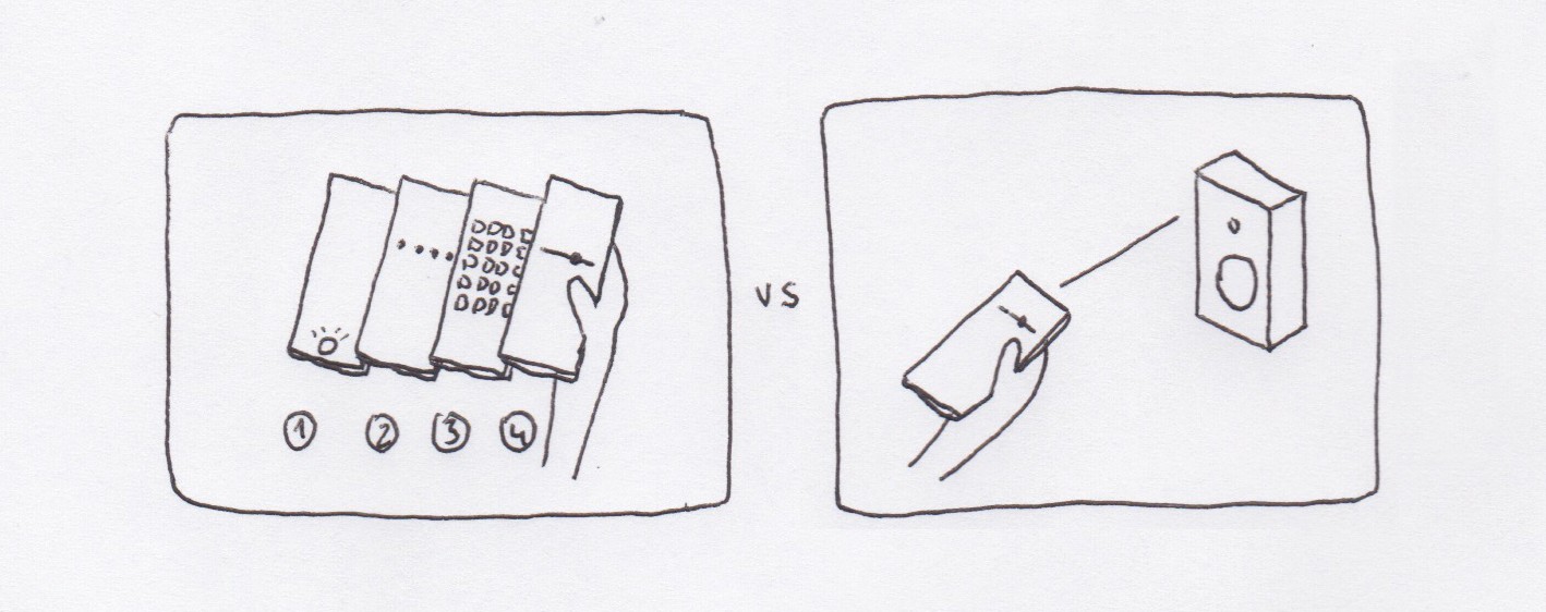
Most of these interactions require unlocking the phone, finding an app, and performing an action. They’re all end-to-end digital interactions, despite that what we want to interact with are things we can touch and see, things we can point at: “I want to interact with *this* thing”.
What if we pointed our phones at those things?

As phones get better at understanding their position and orientation in relation to their surroundings, we may be able to interact with our surroundings in a more intuitive and natural way.
Notes:
- Most of these interactions don’t deal with sensitive information and shouldn’t require user identification.
- You could discover new features / apps by pointing at objects / places.
- With the use of haptic feedback some of these interactions may not even require you to look at the screen.
- Pointing with your phone at other devices may offer different options based on the relationship between the owners: pointing at my computer vs. pointing at a friend’s phone vs. pointing at a stranger’s phone.
Another video sketch I did a few years ago on a similar topic: Spatially Aware Devices
Peek: less skimming, more reading
Sunday, February 8th, 2015I read a lot, but not really. Everyday I scan tenths of articles on the web – blog posts, news articles, essays. I may read word-by-word only 1 out of 100, if any. I find myself skipping full paragraphs and scanning for words in articles, specially in long ones. Is not that I’m not interested, it feels more like I don’t know how to read properly anymore.
The same happened with books. I started many last year, I only finished two. I try hard, but I lose focus and my mind starts wandering. I stare at the book and my eyes follow the lines and send stuff to my brain, and my brain is like “sorry I’m busy.” And then I turn the page and I realize I didn’t get anything about what just happened in the story. I look smart in the subway though.
I was curious to know why this is happening, and what to do with it. I found some answers by reading (!) a fantastic book, The Shallows by Nicholas Carr. Nicholas explains how the human brain has been reconfiguring itself, optimizing to the types of input it receives. When books became popular the human brain adjusted to a calm, linear type of input. With internet, our brain is rewiring for a fast, short, sometimes overlapping bits of information. As he puts it:
“I realized my brain wasn’t just drifting. It was hungry. It was demanding to be fed the way the Net fed it”
And not only hungry, our brain is also optimized for problem solving and being time efficient, also when reading. This is the consequence of our brain being trained everyday to navigate the web; finding the right keywords to search for specific information from a vast repository or scanning and filtering our social feed when we have one minute to spare.
There is another interesting article on how users read on the web. It starts with a summary: “They don’t”, and provides recommendations to design your text on the web according to the new readers’ abilities. In general, it suggests the use of ‘scannable text’, and somehow editorial platforms on the web like Medium provide formatting tools that are aligned with this directions. Having the reading time at the beginning of an article is already a good step towards calming down our brain, setting the expectations.
One of my hypotheses about why I scan articles instead of read them is that I’m not sure if I’m interested in the article, thus I don’t want to spend time reading it word-by-word to find out. Because you know, there are a few other articles to read on the web.
I posed myself a question: Is there a way I can better select what I read, without having to scan the articles? Trying to answer this question I sketched a concept for a reader, or maybe it’s just a feature for a reader. I called it Peek – a mobile reader that helps you filter what you read.
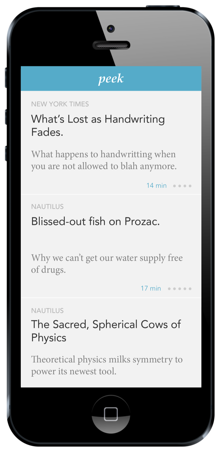
Peek gather articles from selected sources and presents them with peeks, 3 to 5 relevant excerpts. It’s your decision to dive into the long read, or fly over the next article. Peek eliminates skimming – long or short, you’re always reading.
In the main screen, a list of articles from different sources:
By swiping left on an article you reveal the peeks for that article, the most relevant* single sentences of that article. If a peek catches your attention, you can tap to access the full article, right where the excerpt is from. This way you can also read the part that is related to that peek that caught your attention without having to go through the whole piece.
The tool has also a highlighting feature, to mark interesting passages of an article, similar to the way you can highlight content on a Kindle. To highlight a sentence simply double tap:
*The highlighting feature has the double function of generating the peeks, by aggregating the highlights from multiple users and selecting the most relevant ones.
There is risk in relying on user’s input to create the peeks, the core of the concept. However, it seems proven that people use this feature on other platforms such as the Kindle, using a more arduous way of highlighting than a double tap. There may be other ways of defining crowdsourced ‘heat maps’ of interest in long pieces of content on the web (articles, talks, etc.) by looking at other parameters, such as comments – I sometimes use that in Medium to see what’s hot on an article.
I’m not planning to develop this in the near future, but still curious if a tool like this could help me read more, and better.
Slow light
Tuesday, March 5th, 2013A couple of years ago in a Q&A for The Creators Project they asked me:
What fantasy piece of technology would you like to see invented?
I said:
A simple knob that connects to any source of light, so it slows down the speed of the light. Even down to zero, like a lightsaber.
I always dreamed about the endless possibilities if such a magical thing was ever feasible. And I recently discovered that it is happening! In the last story of this podcast from Radiolab (min. 45),
Danish physicist Lene Hau explains how she has been able to slow down a beam of light, passing it through an ultra-cold cloud of sodium atoms. She has also been able to transform the form of light into matter, recording the shape of the light pulse with a laser. This light copy (or light metadata) can be stored, and the light form re-created in another place and time.
Collection of sunsets
Cold-cloud photo camera
Data forecast
Wednesday, November 28th, 2012Flaps: fast and contextual browsing
Sunday, November 11th, 2012Web browsing is probably the main activity we use computers for today. Tabs have been a universal standard in web browsers, helping a wide range of users to navigate the web. Tabs provide a visual representation of the active webpages, waiting to be processed: either read them, discard them, keep them for later, or archive. Lately I’ve been trying to question if tabs are the best way to navigate web content.
The way tabs are sorted is a combination of time (new tabs open at the right end of the tabs bar) and source (new tabs from links coming from a specific webpage will sit next to that webpage’s tab). This two sorting strategies combined with the flat visual representation of the tabs doesn’t help navigating them, specially when the tab bar is cluttered and web titles and/or icons are hidden.
If we take the tabs metaphor back to its origin, while organising paper documents we used to write names on the folders, use coloured folders or use different drawers. Tabs on the browser are ethereal and don’t require such a structure, although they could potentially organise themselves understanding the typology of webpage they host. Tabs could be organised by type of content (media, personal, social, etc.) or use (in focus / in background, one time / frequent access, etc.)
Tabs are designed for ‘point and click’ in order to navigate through them. Pointing at things requires shifting the focus of attention and it usually slows down the interaction.
In order to understand how browsing could be improved, I analysed some of the behaviours I have developed while browsing (I use Chrome):
– I usually don’t look at the address bar when launching websites or performing searches. The shortcut to open a new page (Alt+T), Chrome’s omnibox, and the autocomplete converted the bar to an invisible interface. I think about reading the news and the news website appears on screen, putting zero effort on thinking how to get there.
Also I have noticed that I normally don’t keep open those webpages I visit frecuently. I normally create a new tab and launch the webpage, do what I need to do and I close it right after to come back where I was. One of the reasons I unconsciously develop this behaviour is that it’s faster and less disrupting to create a new tab (alt+T, type first character, Enter – 0.25sec max) than activate a tab that is already open (find the tab, point, click, refresh – 1sec + change of visual focus + potential procrastination). Switching between tabs follows the same reasoning.
– I pause/resume the music streaming many times a day and it still takes two or three steps to do so each time. Likewise it takes many steps to save an image either to my local or remote repository. Or browse webpages I previously bookmarked. There are many frequent operations that are performed using a generic interface.
– While looking for a specific tab on the tab bar, I sometimes end up checking the news on the way, or my email, or articles that I left open. Having the tabs always and all visible can distract me, although I embrace it and I like it somehow.
Based on the behaviours described above, there are some principles I’d like a browser’s interface to follow:
– Maximise the possibilities for psychomotor automation.
– Mutually adapt with the user and disappear with time.
– Minimise the ‘point & click’ and encourage fast navigation with the keyboard.
– Provide dedicated interactions for operations I perform frequently.
– Provide an adaptive interface that helps to focus, but doesn’t kill procrastination.
Trying to imagine a browser that follows those principles, I sketched Flaps, a full-screen browser with a minimum visual infrastructure, an interface for contextual navigation and dedicated interactions for optimising frequent actions. (play full screen)
Bits of the interface:
– main interface:
– contextual interface, after opening links from a webpage. When possible, webpage titles are formatted to increase its meaning:
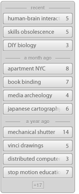
– extended interface, with automatic grouping:
– repository / bookmarks / ‘read it later’ interface:
– example of predefined searches:
– examples of actions over the active website:
Flaps is just a video prototype for now – I’d be curious to let people try it and see how their browsing behaviours would evolve. There are a few aspects that haven’t been tackled in this prototype, that should be taken into account while implementing an interactive prototype (loading progress feedback, history overview, need for full length URL’s, optimise position of the interface for different webpages and screen ratios/resolutions, compatibility with existing keyboard shortcuts, etc.)
Any feedback on the concept, as well as input about personal behaviours and workflows while browsing, is very welcome!
Interaction Design Awards 2013, enter your work!
Saturday, September 15th, 2012Seven months have passed since I was invited to the Interaction Awards ceremony to receive an award for the project Pas a Pas. It was a true honour to participate in the event and to be recognised alongside all of the great designers I had the chance to share the experience with.
The award ceremony was part of Interaction’12, a conference fueled by a community of passionate designers that represent where and how Interaction Design is practiced today – from well-established design companies to emergent studios, from large technology firms to research centres, from professors to students. The various levels of experience and wealth of knowledge was acknowledged by the first edition of the Interaction Awards, which recognise work in numerous categories that represent how broad our discipline is.
Spending those three days in Dublin was a great opportunity to learn and be inspired by outstanding keynotes, to connect and debate with designers from around the globe, and contribute to a very active community. It was lots of fun too!
With just a few days left to submit new work for the next edition of the Interaction Awards, I would encourage all students that have been taking part in an Interaction Design education to submit your best work and take part in this great experience. For those who are planning to submit projects I’d like to share a couple of aspects that I feel are important when creating a strong project profile.
1. Frame your project.
A school project differs in many aspects from a professional project. While clients, budgets, technology roadmaps, deadlines are constraints for design companies or departments, student projects are often driven by other aspects – a theme or topic as brief, personal motivation or interests, the pursuit of a specific skill, the opportunity to collaborate with a company or social collective, etc. It’s important that those constraints, motivations and aspirations are reflected in the application to help the jury understand your initial playground.
2. Describe your journey.
Besides experiencing a new product or service first-hand, there is nothing more exciting for us, designers, than understanding what happens behind-the-scenes. Walk people through the steps on your project, describe the key moments of your process and how they had an impact on the outcome. This is where the jury can sense your passion, recognise your ability to take the right decisions, and discover your intention for each of your prototype’s iterations.
3. Evaluate the outcome.
In opposition to the previous point, it can also be valuable to detach ourselves from the process and the passion we’ve put into the project – that’s important when evaluating where we are in the process and how far we are from the initial expectations.
Whether it’s a ready-to-market product, a concept for a large scale service or a stepping stone that opens new opportunities, there is always a way to validate the concept, a scale to evaluate its impact, and a path to pursue it’s highest potential.
Besides writing about it, there is nothing more powerful and honest than a video showing people trying out your concept in a real environment. Show enough to let the concept shine by itself, let the audience identify with the people in the video and envision the potential of your idea.
I’m very looking forward to see this year’s entries for the Interaction Awards. Good luck with your submissions and hope to see everybody next January in Toronto!


