Sketching a stop motion tutorial
Wednesday, June 23rd, 2010Having tested a possible projector setup and played with some animations, I jumped to how a stop motion tutorial would look like. I chose to use a quite typical animation to practise shape and motion evolution.
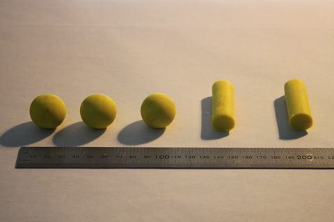
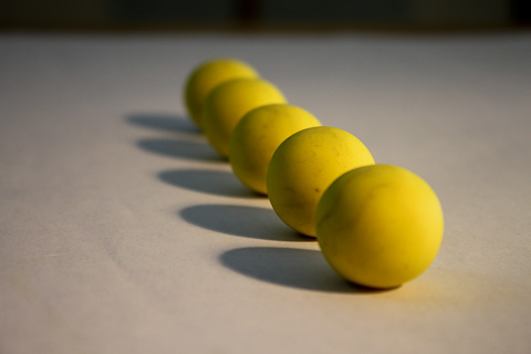
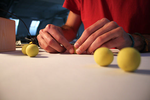
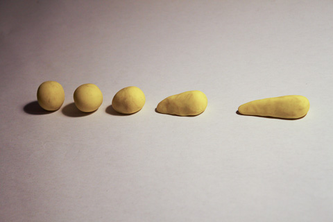
The idea is to provide a set with the five pieces in order to make the following animation:
In order to guide the children to animate the sequence, a projection on the table indicates which piece and where it has to be placed (position and orientation), in each frame. I thought that would be interesting to show the position of the piece of the last frame (in green). It helps to move from one frame to the other and it also introduces the concept of onion-skinning, really helpful in more advanced animations.
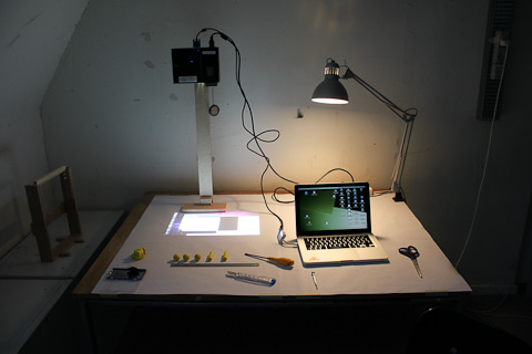
In that case I made another stand, without mirrors, to simplify the operation, reduce the setting time, and avoid image distortion.
I quickly prototype the projection with Processing, and it looked like this:
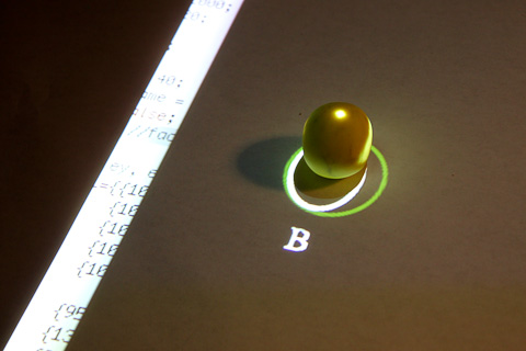
In the image above the guide indicates to place the piece “B” inside the projected ellipse. The white ellipse goes over the object, a non-desired effect.
This happens because the projector beam is not completely perpendicular, and even it was, it has a shape of a cone so is hard to center an object at the corners of the projection, without blocking the light with the piece.
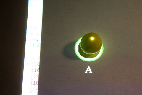
In this case I moved the projector in the vertical axis over the object, with better results.
The circle in green indicates the position of the previous piece (“D”).The white dot helps to match the piece when it can have different orientations. Just to clarify, the piece should have a painted dot also, there should be only one of the pieces if it were a stop motion frame, and the light projection wouldn’t be shown, since it will switched off when the picture is taken.
I’ve noticed that even if the projector is projecting “black”, there is some light filtered, producing a shadow that will appear on the frame picture. This can be solved with proper lightning, although it’s expensive and not easy to set up.
The idea of combining the projector and the camera is really appealing and with high potential, but due to the shadows and the need of perfect perpendicularity, I considered evaluating other possibilities. One could be a tabletop with back projection, or even a LCD screen under a glass table, to show the information and the tutorial. That would remove one of the main benefits of having a projector though, which is the magic of the cinema, to project the movie on a wall once it’s finished. It also constrains the places you can elaborate an animation movie, and the “device” increases in size and cost and decreases in maneuverability. I’ll make a more detailed evaluation on that point.
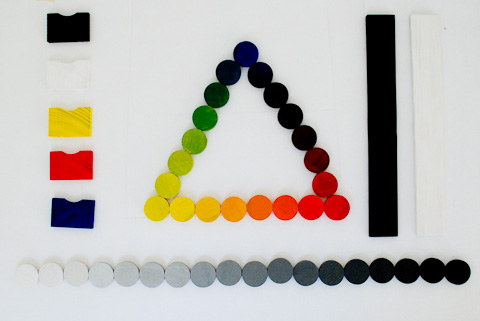
In order to try out another possible tutorial, I started experimenting with basic colors, color gradients, gray-scales, etc.
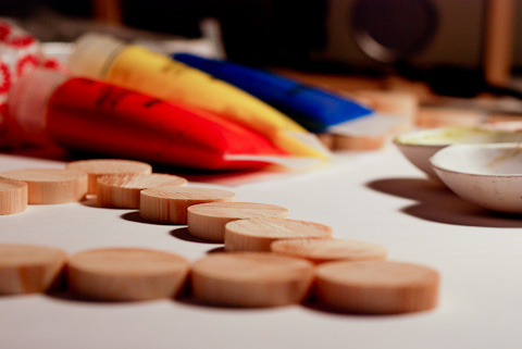
I painted 18 pieces of wood using the main colors of subtractive mixing, and primary color triad in Newton’s disc – Red, Yellow and Blue (RYB). I also painted 18 wood pieces on a gray-scale.
I wanted to use a webcam because it’s much more easier to use with iStopMotion software than an SLR camera, but I got a lot of flickering, and the color temperature / WB was not easy to adjust. I used my camera instead, Nikon D80 controlled remotely using Camera Control Pro and manual AF. Due to the short focal distance I used a 18-135mm lens, at 18, getting the corresponding lens distortion.
I made some tests combining color morphing and position. It’s easier to appreciate color transitions at 10fps than 20fps. On the gray-scale, the effect of morphing is good at 20fps, while at 10 it would be more visible the change of pieces.
Neither the paint nor the wood are good quality, then the color is affected by the dark wood stripes. However, the result is quite good. I’m now trying to thing about how to provide a better experience while doing the animation and a better understanding about the color mix. An option would be to show, next to the mark for placing the piece, the percentage of each color, or an object/element with that color so kids can easily relate it to something real:
90% Yellow + 10% Red · Canary
50% Blue + 50% Red · Aubergine
Using steps of 10% implies having 10 pieces for each color transformation, which is not the best way to show the color mix theory- it uses to be primary colors (RYB) + secondary (violet, orange, green) and intermediates, so 12 colors. Another option would be to show the percentages using fractions (adding maths to the tutorial):
1/12 Yellow + 11/12 Red = 1 Canary
Another thing to explore and define: the piece labeling and identification, and the extra information provided to complement the learning experience.
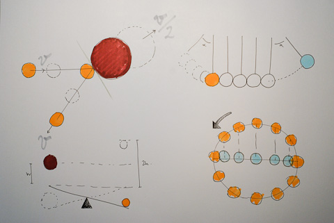
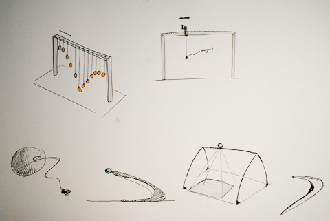
Thinking about other content areas to include as tutorials, I feel that physics it’s a topic that really fits in the stop motion world for educational purposes. Physics is taking time and space as main dimensions to explain the reality, either graphically or numerically. Stop motion is about time and space also. Here some primary sketches:
A bridge structure might be useful to simulate ball bouncing or vertical axis movements affected by gravity. It can be also used as a stand for the camera or projector.
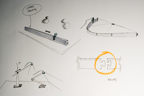
And related to animation techniques itself, it would be interesting to build a tool to help children do camera travellings, not really common in amateur stop motion because the difficulty of keeping consistent steps. It could be a modular system to build rails for the camera, with marks on it to keep constant steps.
The final project will be briefly paused since I’m currently working in an Industry Project, a collaboration between Lego and CIID.
