ISHAC BERTRAN

Archive for the ‘ciid’ Category

Testing a flat screen as surface for animation

Sunday, August 1st, 2010

After the Industry project with Lego and a two-weeks break in Barcelona, Menorca and Melt Festival in Berlin, I took up again with my final project.

Analising pros and cons of the projector setup together my advisor Vinay Venkatraman, we found interesting to explore another option to display the tutorials, using a flat screen.

Pros of the flat screen (comparing to projector): cheaper, less space needed, less problems with environmental light to have a good contrast.

Cons: it doesn’t have the magic of the projector, specially to project the movie as in cinema. And… reflections!

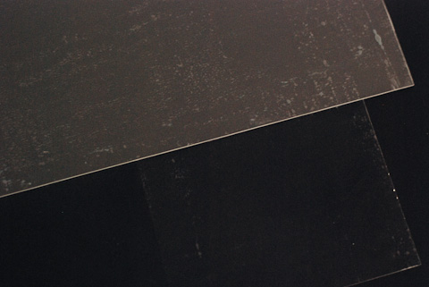
In order to have a resistant surface to place the object for the animation, I cut a piece of acrylic. The screen is non-reflective, but with the acrylic, it is, so the camera is reflected and appears on the image.

The surface has to display a sharp image, and it has be: non-reflective, resistant, and nice. It has to be nice because it’s the main surface of the product, children will be touching it all the time, and will be the background for all the pictures – I think mat black would be the best. I tried to cover the acrylic with different materials – fabric, tracing paper, translucent plastic and acrylic, … non of them were convincing, either for the quality of the image or the color of the surface.

I found a non-reflective film, quite tricky to stick on the acrylic, that almost worked, but the finish wasn’t nice. Apart from the bubbles the color was a heterogeneous grey, instead of the homogeneous black that it should be.

The best result I achieved was by painting (not opaque, just a bit) a piece of acrylic using black spray. Then I stuck the film, and the result was good.

I’m happy with the result, the image is a bit less bright that without the acrylic, but the surface is much nicer than the acrylic without paint.

I should find a way to paint the acrylic more homogeneous though – or a graffiti painter that helps me do it!

Sketching a stop motion tutorial

Wednesday, June 23rd, 2010

Having tested a possible projector setup and played with some animations, I jumped to how a stop motion tutorial would look like. I chose to use a quite typical animation to practise shape and motion evolution.

img_8304b1

img_8312b1

img_8316b1

img_8324b1

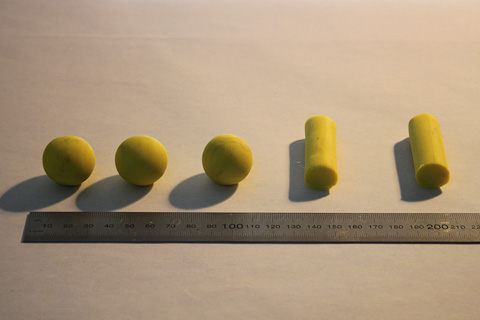
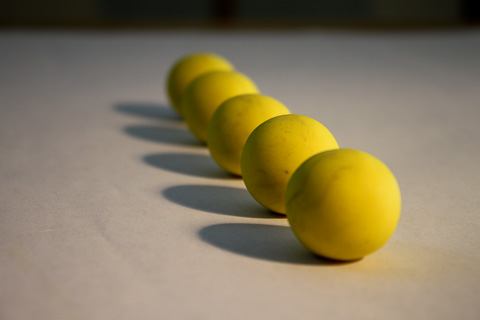
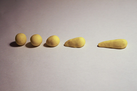
The idea is to provide a set with the five pieces in order to make the following animation:

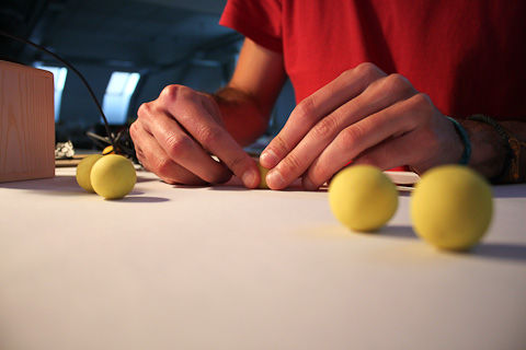
In order to guide the children to animate the sequence, a projection on the table indicates which piece and where it has to be placed (position and orientation), in each frame. I thought that would be interesting to show the position of the piece of the last frame (in green). It helps to move from one frame to the other and it also introduces the concept of onion-skinning, really helpful in more advanced animations.

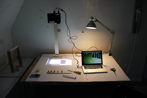
In that case I made another stand, without mirrors, to simplify the operation, reduce the setting time, and avoid image distortion.

img_8307b1

I quickly prototype the projection with Processing, and it looked like this:

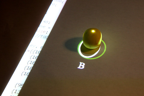
img_8317b1

In the image above the guide indicates to place the piece “B” inside the projected ellipse. The white ellipse goes over the object, a non-desired effect.

img_8322b1

This happens because the projector beam is not completely perpendicular, and even it was, it has a shape of a cone so is hard to center an object at the corners of the projection, without blocking the light with the piece.

img_8319b1

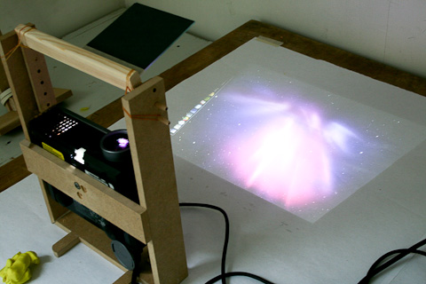
In this case I moved the projector in the vertical axis over the object, with better results.

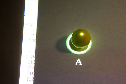
img_8320b1

The circle in green indicates the position of the previous piece (“D”).The white dot helps to match the piece when it can have different orientations. Just to clarify, the piece should have a painted dot also, there should be only one of the pieces if it were a stop motion frame, and the light projection wouldn’t be shown, since it will switched off when the picture is taken.

I’ve noticed that even if the projector is projecting “black”, there is some light filtered, producing a shadow that will appear on the frame picture. This can be solved with proper lightning, although it’s expensive and not easy to set up.

The idea of combining the projector and the camera is really appealing and with high potential, but due to the shadows and the need of perfect perpendicularity, I considered evaluating other possibilities. One could be a tabletop with back projection, or even a LCD screen under a glass table, to show the information and the tutorial. That would remove one of the main benefits of having a projector though, which is the magic of the cinema, to project the movie on a wall once it’s finished. It also constrains the places you can elaborate an animation movie, and the “device” increases in size and cost and decreases in maneuverability. I’ll make a more detailed evaluation on that point.

In order to try out another possible tutorial, I started experimenting with basic colors, color gradients, gray-scales, etc.

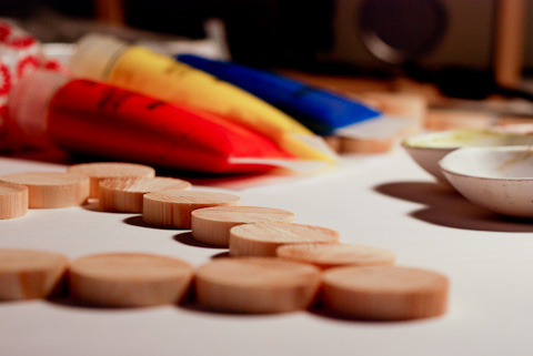
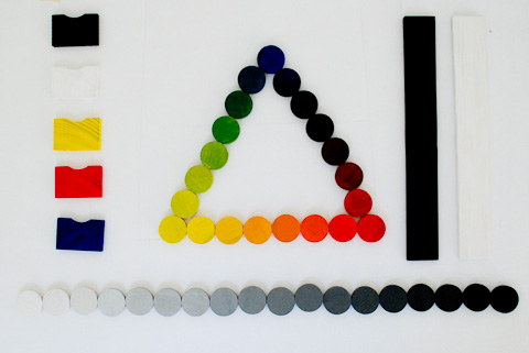
I painted 18 pieces of wood using the main colors of subtractive mixing, and primary color triad in Newton’s disc – Red, Yellow and Blue (RYB). I also painted 18 wood pieces on a gray-scale.

dsc_8517

dsc_8540

dsc_8600

dsc_8552

dsc_8556

I wanted to use a webcam because it’s much more easier to use with iStopMotion software than an SLR camera, but I got a lot of flickering, and the color temperature / WB was not easy to adjust. I used my camera instead, Nikon D80 controlled remotely using Camera Control Pro and manual AF. Due to the short focal distance I used a 18-135mm lens, at 18, getting the corresponding lens distortion.

img_4073

I made some tests combining color morphing and position. It’s easier to appreciate color transitions at 10fps than 20fps. On the gray-scale, the effect of morphing is good at 20fps, while at 10 it would be more visible the change of pieces.

Neither the paint nor the wood are good quality, then the color is affected by the dark wood stripes. However, the result is quite good. I’m now trying to thing about how to provide a better experience while doing the animation and a better understanding about the color mix. An option would be to show, next to the mark for placing the piece, the percentage of each color, or an object/element with that color so kids can easily relate it to something real:

90% Yellow + 10% Red · Canary

50% Blue + 50% Red · Aubergine

Using steps of 10% implies having 10 pieces for each color transformation, which is not the best way to show the color mix theory- it uses to be primary colors (RYB) + secondary (violet, orange, green) and intermediates, so 12 colors. Another option would be to show the percentages using fractions (adding maths to the tutorial):

1/12 Yellow + 11/12 Red = 1 Canary

Another thing to explore and define: the piece labeling and identification, and the extra information provided to complement the learning experience.

Thinking about other content areas to include as tutorials, I feel that physics it’s a topic that really fits in the stop motion world for educational purposes.  Physics is taking time and space as main dimensions to explain the reality, either graphically or numerically. Stop motion is about time and space also. Here some primary sketches:

dsc_8559

dsc_8565

A bridge structure might be useful to simulate ball bouncing or vertical axis movements affected by gravity. It can be also used as a stand for the camera or projector.

And related to animation techniques itself, it would be interesting to build a tool to help children do camera travellings, not really common in amateur stop motion because the difficulty of keeping consistent steps. It could be a modular system to build rails for the camera, with marks on it to keep constant steps.

dsc_8566

The final project will be briefly paused since I’m currently working in an Industry Project, a collaboration between Lego and CIID.

Animation experiments

Saturday, June 19th, 2010

dsc_8515b1

Size, shape, position and add/substract are the main topics to learn in animation, in this order.

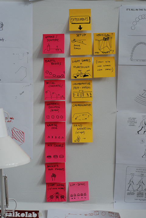
Brainstorming on this idea and trying to incorporate also other educational content areas, such as physics or maths, I listed some potential tutorials:

– Appear / disappear

– Elastic bodies

– Physical kinetics

– Morphing

– Walking cycle

– Color mix

– Light mix

– Finger animation

– Lip-sync

– …

Escher could be a good example for morphing experiments:

escher1

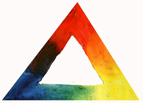
Color mix is also a good topic where stop motion can help, both for additive and sustractive colors.

colormixtriangle

additive_color_mixing

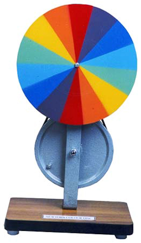
Which frame rate would be needed to have the effect on the Newton’s disc using the color palette in different frames?

newton

On the other hand, there are also some experiments that I’d like to carry to reduce the possibilities  and to test possible games or experiences for the children:

– Setup camera+projector

– Light + play-dough combined: let the children follow some shapes projected with play-dough for example

– Collaborative stop-motion: one child starts and another continues the animation where the other has left it

– Choreography with objects

– Hand animation

– Experiment with other spaces / camera positions for shooting

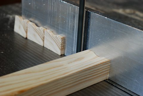
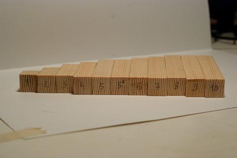
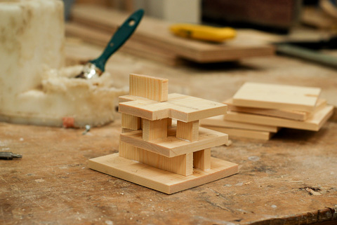
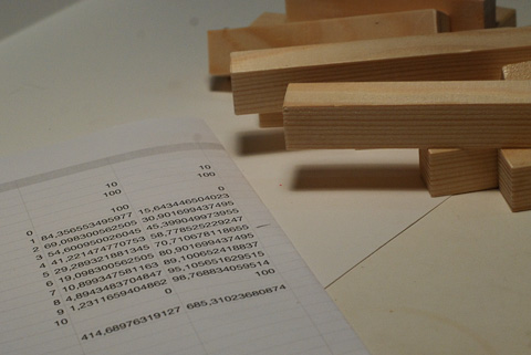
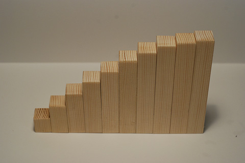
To put things in practise and also to get more experience on stop motion, I built a set of wooden pieces to animate a tower growing and disappearing. I designed two sets, one easing the bottom and another easing the top, following a sinusoid.

dsc_8299b1

dsc_8301b1

dsc_8303b1

Following a movie that shows the effect of:

1- Easing the bottom

2- Easing the top

3- Independent movement: combine two movements easing the top. The feeling is that the movements are independent, since the variations from one frame to the next doesn’t match from one tower to the other.

4- Connected movement: combine two movements, one easing the top and the other easing the bottom. Now the variations from one frame to the next match in both towers, having the feeling that they are connected under the table.

A problem I realised with this experiment is that the auto-brightness on the camera changes on each frame since the average light changes on each frame. So far I haven’t found any way to disable this feature on any camera connected to a Mac. Bad news because this will be needed.

Another known issue is the interlacing. I was shooting using a light bulb and the camera gets the frequency producing these horizontal lines. To take into account.

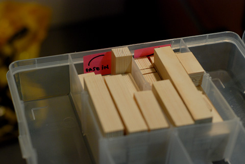
It’s really easy to mess up the pieces, so from the very beginning, I tried to apply one of the main rules for animation: organisation!

dsc_8305b1

dsc_8307b1

Projectors and mirrors

Saturday, June 19th, 2010

Two weeks ago I made some experiments test some technical aspects and possibilities for the setup of the stop motion animation kit. Still to decide if it will be a kit for schools, a toy for home, an application for iPhone/iPad or a game for PlayStation, I wanted to understand a bit more about these possibilities and the technique of stop motion itself.

I started testing the angle and distortion of the projector. Although for the final prototype a smaller projector might be better, I started testing with mid-sized and powerful one. Some days ago I tried a pico-projector in a shop and it’s not bright to show sharp shapes even on a dim-light room, and it needs a certain distance to show a frame of 50cm wide. And the more distance, the less brightness… The positive thing is that it doesn’t get hot at all, and you can embedded in a case or box.

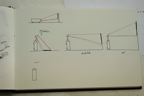
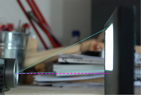
Trying to achieve a compact setup (that can fit into a box) I considered to put the projector vertical and use a mirror to project the image to the table. I’ve learnt that the projectors have a projection line – while using mirrors, you need to keep this line getting perpendicular to the final surface of projection to avoid distortion. In the projector I’m using, the projection line is even outside the projection range:

dsc_8192b1

dsc_8191_lines

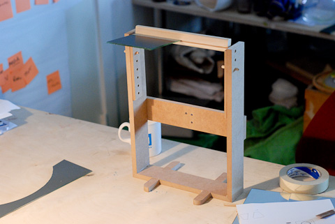
I built a stand for the projection that allows to regulate the height and angle of the mirror.

dsc_8201b1

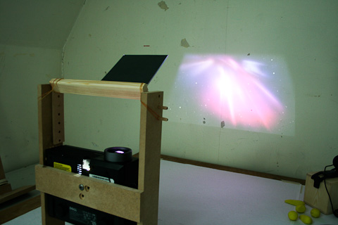
This setup allows to project the tutorials for the children on the table, and with a small change on the angle of the mirror, to project the movie on a wall. The distortion on the table is quite high. Using the camera it’s possible to recognize the deformation of the image and correct it automatically (projecting a pattern, calculating the distortion and adding the conversion accordingly). This could be done with Processing with some mapping applications like Keystone or ProjectedQuads. The squared area after the correction would be pretty small though.

img_4022

img_4029

Probably this is not the best setup for testing the tutorials because the distortion, but gives an idea of the distances to the table and wall, angles for the mirror, and size of the working area.

A new paradigm for stop motion animation?

Wednesday, June 16th, 2010

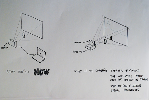
The exploration motivated me to find an adaptive solution for educational purposes in the field of animation. In my thesis I will explore potential improvements both on the technical and the educational side. I decided to start this exploration on both sides by introducing a paradigm shift regarding the typical animation setup. Normally a camera that captures the frames is connected to a computer that is used as interface, and to review the images, edit and display the final video. The animation process happens in one physical space, while the processing happens on a screen.

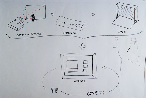
My concept is about combining both the stage and the projection space in one, having a camera and a projector pointing at the same area. That would lead into a stand-alone product without requiring an external computer for any of the stages of animating or watching the movies. At the same time, all the action, interaction and information related to the animation is happening in the same space.

dsc_8108b

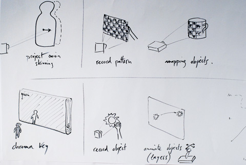
This new setup automatically triggers many possibilities for teaching video or visual techniques (chromakey, projection mapping, etc. ) in a more tangible and intuitive way, without a computer.

dsc_8110b

Although these possibilities are really appealing to include on the set, they would not be the focus of my thesis. I would rather focus on simple tutorials to learn the basics of animation: physical kinematics, morph, walking cycle, etc. I would also to use stop-motion as a tool to teach other concepts not directly related to animation: colour mixing, elasticity, etc.

I find really important also to give this concept a social part, a way to exchange the movies and create an extra motivation. Children today are used to be online and share their activities virtually. A constructive way of doing it is building a system that enables children (or schools) to share the movies created with the kit, and see movies from others. It generates also opportunities to create collaborative movies in which a kid continues the work of another kid, or split the roles to create a longer movie. It also serves to get inspiration from others’ movies. Building an online community also facilitates to spread the material created with the device, and build connections with local TV’s or film contests.

dsc_8109b

So, the design challenge:

How might I create a tool that helps teaching the basics of animation to children in a meaningful, intuitive and playful way? How might I provide a solution that could be sold as a product? How might I bring back the tangibility of the animation and editing techniques of the past times? How might I build a stronger bridge between abstract concepts on different content areas in education and reality, through an innovative animation process?

The design work can be split in three parts that will be carried out in parallel:

A – the physical setup that allows capturing the animation and project the result,

B – the interface to operate this product,

C – the sets of objects that allow an enhanced educational process.

In the first part I’ll make experiments to define the best setup using a camera and a projector, basically in terms of angle between them, light conditions on the room, etc. I’d also like to explore new places to animate – normally is done on a table, but for example under it would be a good space. This could bring new positions for the camera and projector (vertical, 45º angle, etc.)

In the second part I’ll define, prototype, test and refine the interface for the target group and features that better provide a learning and fun experience.

In the third part I’ll design the set of objects that allow to learn the basics of animation, and also explore with experiments that bring a better understanding over other content areas, as physics or art. This phase will include shape and material exploration, as well as motion cycles experimentation.

During the exploration and development I’d like to focus on delivering a high quality product, experience and sets of objects that fulfill the purpose of the device. It will be tempting to explore the possibilities that the new setup allows, but within the short time frame of the project (six weeks of work from now) I should stick to deliver a simple and meaningful solution, for a specific target. Specially the conception of the user interface will be much easier if the target is well defined and possibilities of the device are narrowed down to the most basic and most powerful ones.

It’s a product for educators (parents or teachers at school) and children. It’s a design for the present that hopefully would fit also in the future.

Exploring the field of animation + education

Wednesday, June 16th, 2010

I’m interested in photography, animation and video production as means of expression, a canvas for creativity. Stop motion is in the middle of these fields, and has a tangible component that makes it really appealing for me. Although we’re surrounded by high-tech devices, the tangibility in stop-motion is still one of the main values. Old video and film editing machines and techniques are an important inspiration for an attempt to remove the computer side of the animation as a tool, and bring back the tangibility of a past time.

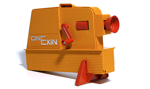
In that field, I’m deeply inspired by a toy I had when I was a kid, the Cinexin – an item of my generation in Spain. It was a Super 8 projector with a really simple interface. The ritual was a nice part of the experience: select a short movie from Disney classics, place it in, switch off the light of the room, switch on the lamp of the projector, focus, and use the handle to animate Mickey forwards and backwards at the pace you want.
cinexinb

On the other hand, designing for children is always a challenge and a big responsibility – there is an important impact on our designs in that range of age, when they have the greatest capacity to learn and also they build the pillars of their background and behavior.

I’ve been researching around the combination of stop-motion, education, animation, children. I’ve found different articles emphasising the advantages of using animation as an educational module for kids from different age ranges.

Currently there is an easy access to the tools needed to create a stop-motion movie – a computer, a low-cost webcam and one of the many easy-to-use software applications. This software applications have many features: control over multiple layers, onion-skinning, chromakey for background or foreground overlaying, voice sync, etc. – all of them are targeting a productive purpose, non of them are aiming at educative purposes.

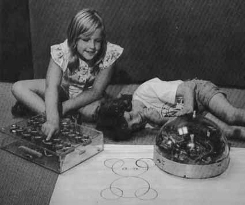
I found an analogy that worked when I was a kid. At the age of 6 to 10, we learned the basics of coding with Logo, a computational language. It was our first introduction to the logic, linear structured commands and nested actions to execute a sequence, with graphics as an outcome. As a support to understand these pretty abstract concepts, we had a Turtle robot; basically it executed the commands introduced one by one: moving forwards, backwards, turning left and right – as the cursor in the screen would do on the computer. There was a reason to code (to bring the Turtle from one room to the other, make it draw a flower on the floor, etc.). It was something real executing the commands after pressing “GO”.
logoturtleb

This physical side of the computing lesson made the code much more understandable and meaningful for us, as it drew a bridge between the abstract and the real.

In animation, the walking cycle or the physical kinematics are not obvious since is not natural (neither for children nor for adults) to break a natural movement down to 15 times every second, and treat it as a series of still images.

I think there is room for a product to help children better understand and play with the basics of animation, a link between the movement of the living life and the professional tools and techniques for stop-motion. During the research I’d like to find out that is not only a space where this product could exist, but a product that is needed to facilitate, enhance the experience, foster the creativity and make more fun the process of learning stop-motion animation.

READING

Following, some of the comments I gathered from different people related to animation and education.

“No other technique simply demonstrates the basics of human movement and animation better then stop motion.  The child can physically move a object and in a relative short time see these movements turn into animation”. (source)

“Stop motion animation is one of the best ways to build digital communication skills and team work into any curriculum. (…) The really great thing about stop motion animation is that it can be used effectively with any subject and at most age levels. I have worked with students that successfully animated subjects from science (life cycle of a butterfly), social studies (scenes from Lewis and Clark), math (slope), and of course language arts with any dramatic or comedic narrative.

(…)

Stop motion is a great way to integrate writing and decision making into your curriculum. Planning is a critical step in the process of creating any story. One of my favourite things about stop motion animation is that it brings students together in such a natural way that you will see amazing results. During the planning process you will have those that prefer to write the script while others prefer to draw the storyboards. Next, some of the students will naturally gravitate to building the sets and creating the characters while others prefer to set up the cameras, lights and computer. (…) No other activities I do brings students closer together than stop motion animation.” (source)

Wendy Jackson Hall was one of the most known animation teacher in the States. From her article “An Analysis of Comprehension of Animation Logic in Young Children”:

“Children today are immersed in media, and in particular, animation, as it is found on television, in movies and in video and computer games. Yet few children think about how animation is created until they are given an opportunity to do so themselves. New technologies available for home and school use are making animation an accessible form of self-expression for children.

(…)

Children’s understanding of what I like to call “Animation Logic,” or how animation works, goes hand in hand with concepts learned at each grade level. I have observed children’s comprehension of animation logic on several levels as it connects with other content areas.”

Jackson describes how animation is connected to these content areas such as Math, Arts, Reading and Writing, Science or Physics, and defends the integration of animation courses within the current education system as a powerful complementary topic. Jackson emphasises the importance of adapting the instruction for each grade level, as motivation, attention span, patience, etc. are different for each age range, and individual.

There are four main techniques in animation that have to be taught in the following order:

Size – making an image larger or smaller)

Shape – alter the shape until it becomes something else. Morphing or metamorphosis.

Position – changing the location to create the illusion of it moving around

Add/Subtract – create the effect of something appearing and disappearing.

These steps are based on 2D animation (sketching on a flipbook), but can be easily adapted to a 3D space. After some years of teaching she could draw certain conclusions about every age range:

5-6yo – They learn by repetition, buy the short attention span is the main hurdle to follow the process.

6-7yo: Emerging ability to morph shapes. Try to tell stories like the ones they are reading.

7-8yo: Begin to demonstrate an abstract sensibility.

8-9yo: Want to tell stories about their lives, and express emotion.

9-10yo: Can understand optical illusions. They can visualise action in slow-motion. They get into the pure concept of motion, creating abstract sequences, shapes o lines moving.

10-11yo: Start to lose ability to create simple good animation because of their stronger urge to tell complex stories.

11-12yo: They come up with amazing concepts for timing, cycles, and economical use of their drawings. Need to own their images, have an independent identity. They display a sensibility for abstract images.

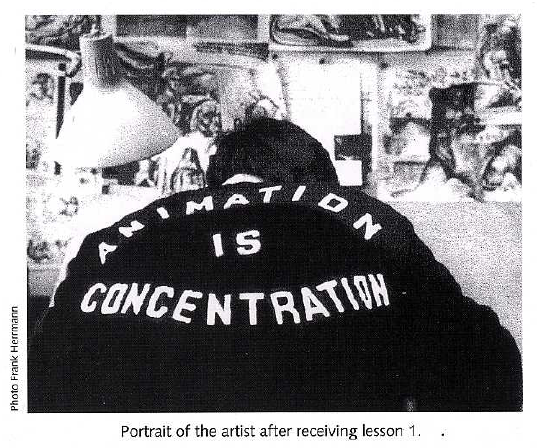
I’ve been reading also some animation books. The bible on this subject is The Animator’s Survival Kit by Richard Williams. The first lesson: concentration!
screen-shot-2010-06-04-at-141711

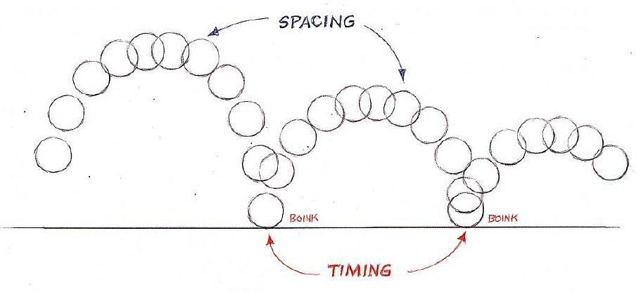
Animation can be easy, but animate well requires years and years of experience. It’s all about timing and spacing – therefore, a lot of physics and maths.

screen-shot-2010-06-04-at-141602

screen-shot-2010-06-04-at-1415421

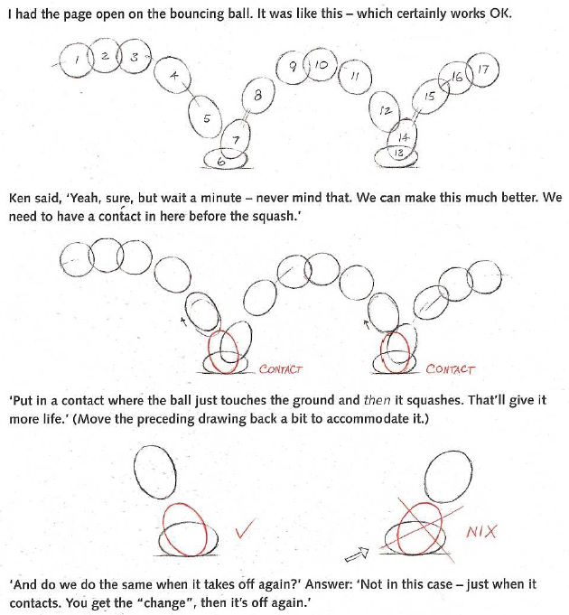
Sometimes is not only to simulate reality, but to distort it to emphasize the feeling of speed, elasticity, etc.
screen-shot-2010-06-04-at-160505

screen-shot-2010-06-04-at-183825

screen-shot-2010-06-04-at-183752

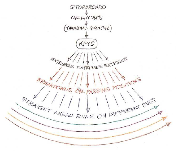
It’s important to be methodical, and start with the keys, the important frames that tell the story, and step by step fill in between key frames. Extremes are extreme positions and breakdowns are middle points between extremes. Good animators draw only keys, extremes and sometimes breakdowns when it’s not obvious. If one of them is not correct, the frames in between will be also wrong. The a junior animator draws the in between frames which requires less skills but more time.
screen-shot-2010-06-04-at-141944

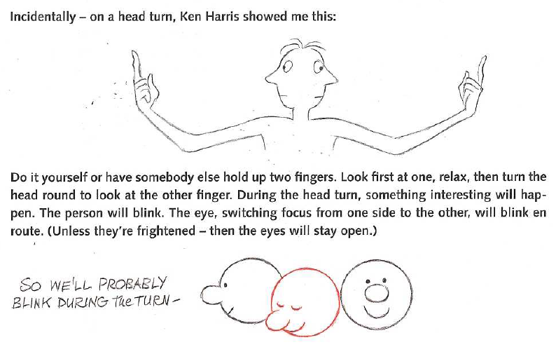
A good animator has the capacity to see reality in slow motion and capture the small details, which make a big difference. Did you know that if you turn your head round, you’ll blink?
screen-shot-2010-06-04-at-155530

I highly recommend this book, it’s really fun and it gives a good understanding about the animation world, and also about our reality, form a different perspective.

OTHER PROJECTS

Regarding existing projects related to animation, I’ve found these ones interesting and inspiring:
Godmode: bringing life to creatures you draw.
Ani-Movie Studio: 2D animation kit.
Toy Theather: animation application.
Motion Book: pages and screen combined for storytelling
The Phonotrope: animation using a vinyl player.
Escalator animation: animation using stickers on a public escalator.

The first frame of my thesis

Tuesday, June 15th, 2010

Some time ago I made my first stop motion movie:

I found one piece of play-dough and I started modelling it randomly, taking a picture for every frame. During the process (it took around 2 hours) I didn’t know what the result would be, how long the video would last, if it would be too jumpy between frames, etc.
Afterwards I put the frames together with Flash, I pressed play, and… magic! I really liked the combination of a patient process pursuing an uncertain result, and the surprise of seeing the small thing coming alive.

At that moment I thought that could be really interesting to transport this feeling to the kids, help them going through the process and see their reaction when they could see the result of their work and patience. I imagined a product that allows children to create their stories in a really simple way, and then a community to exchange these movies, and be inspired by others’ animations.
I take this as the first frame for my thesis. It will be a short and intense movie, hopefully with a happy end!

Perceptions & Assumptions

Monday, June 14th, 2010

We know how to use almost all the objects that surround us. Our ability to learn and retain memories from past experiences, together with our perception of reality, build a set of assumptions over the objects, shaping our behavior while using them. As David Rockeby wrote in his interesting article The Construction of Experience, “the interface itself, by defining how we perceive and navigate content, shapes our experience of that content”. We experience the reality through our sensory system. From Rockeby’s article, “there is the reality out there – raw sensuality. The base of human-reality interface is raw and uncoded. We decode with perceptual filters”.
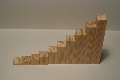
A repeated experience with an object tends to build a standard in our mind. We (designers) use these standards as metaphors to facilitate the comprehension and use of a complex or new concept.

And there is intuition, that is also constructed and being modified based on our experience and sensory perception.

But what happen when we don’t know anything about an object?

I’m interested on how an unknown object can challenge us, how is the process of discovering its functionality, its features, how to operate it. And the feelings that can arise on the user: frustration, disappointment, curiosity, surprise, addiction, etc.

Is it possible to have a new, pure relationship with an object with no assumptions? How many levels of content can we access though our senses? How many other levels are we missing if we only rely in our senses?

Is the intuition a result of our sensory perception and assumptions from our past experiences? Or is an independent dimension?

I started exploring some of these questions with a small experiment as part of an open exploration with the aim to have a better understanding of the essence of the interaction between humans and objects.

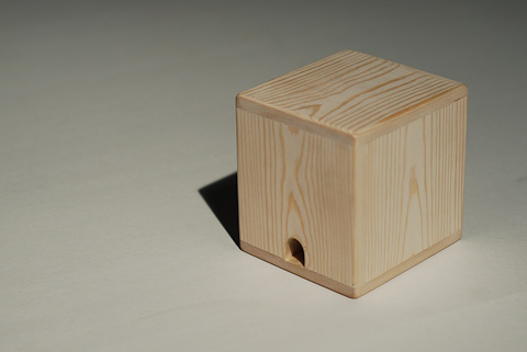
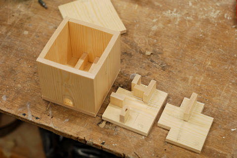
The experiment consisted of giving a wood cube to different people and let them interact with it, with no instructions. The cube has a labyrinth inside, with a ball in it. It has also a hole.

dsc_8244_b

The purpose of the experiment is to generate an instant assumption that drives the interaction with the object. However, during the experiment, the object seems to challenge the assumption, generating doubt about the real goal, addiction or frustration. Here a video of the experiment.

Without any instructions, only by seeing the hole and hearing a ball trapped inside, the goal seems clear. It’s interesting to see the reactions and the evolution of the exploration of the object by different people.

Jacek spent twenty minutes. He found the hole was a problem, as it was setting up a challenge an offering a goal without assuring it – “this hole makes everything complicated”. The curiosity to know what was inside make him thing about other ways to open the box, even break it – which could actually have been the goal, why not?

In other cases there were ups & downs on the motivation to pursue a goal that wasn’t clear. For example during the experiment with Shruti, there is two moments where she seems to give up, but continues for some more minutes. Is the assumption that makes her continue exploring? Maybe the possibility to find another goal? When is it “enough”?

It seemed to be a cycle in all the experiments: exploration, (assumption of the goal), motivation, try understand the inside, query the goal, frustration, (something that made continue exploring or giving up), motivation, and so on.

A bit more analytical, Mayo made some questions to narrow down the possibilities of the purpose of the object, and the experiment. As he explained me later, he spent a some time trying to mentally draw the labyrinth to get the ball out. “It seems that is why it was build for. Or for making music”.

At some point the ball gets stuck on the labyrinth, and needs to be shaken to be released. That added some confusion.

Some other people tried to put stuff inside through the hole to see if it could come out later on.

Laura proposed me to put different materials on the labyrinth’s walls in order to facilitate to find the way out for the ball. She’s always constructive, even building over the assumption that the goal was getting the ball out :).

Actually there was no way out for the ball. The labyrinth was build to keep the ball inside. Some people considered this option but they continued trying, probably because a) there is no way to prove that you cannot take the ball out. b) it’s hard to look down on the obvious goal (a reasoned assumption) and spend time on finding a new uncertain goal.

That experiment has to be considered within a frame of an experiment, since the participants knew that there was a hidden purpose, not just playing. Although they were free to play as much time as they wanted, I’d like to repeat the experiment without asking to participate – leaving the cube on the street maybe. Also I’d like to test it with children, and see in which age they don’t build assumptions with a labyrinth, a ball and a hole.

Here some pictures of the inside:

dsc_6078_b

dsc_6082_b

dsc_6086_b

More pictures here.

Thanks to Jacek, Jennifer, Dean, Elena, Shruti, Laura and Mayo.