ISHAC BERTRAN

Flaps: fast and contextual browsing

November 11th, 2012 by ishback

Web browsing is probably the main activity we use computers for today. Tabs have been a universal standard in web browsers, helping a wide range of users to navigate the web. Tabs provide a visual representation of the active webpages, waiting to be processed: either read them, discard them, keep them for later, or archive. Lately I’ve been trying to question if tabs are the best way to navigate web content.

The way tabs are sorted is a combination of time (new tabs open at the right end of the tabs bar) and source (new tabs from links coming from a specific webpage will sit next to that webpage’s tab). This two sorting strategies combined with the flat visual representation of the tabs doesn’t help navigating them, specially when the tab bar is cluttered and web titles and/or icons are hidden.

If we take the tabs metaphor back to its origin, while organising paper documents we used to write names on the folders, use coloured folders or use different drawers. Tabs on the browser are ethereal and don’t require such a structure, although they could potentially organise themselves understanding the typology of webpage they host. Tabs could be organised by type of content (media, personal, social, etc.) or use (in focus / in background, one time / frequent access, etc.)

Tabs are designed for ‘point and click’ in order to navigate through them. Pointing at things requires shifting the focus of attention and it usually slows down the interaction.

In order to understand how browsing could be improved, I analysed some of the behaviours I have developed while browsing (I use Chrome):

– I usually don’t look at the address bar when launching websites or performing searches. The shortcut to open a new page (Alt+T), Chrome’s omnibox, and the autocomplete converted the bar to an invisible interface. I think about reading the news and the news website appears on screen, putting zero effort on thinking how to get there.

Also I have noticed that I normally don’t keep open those webpages I visit frecuently. I normally create a new tab and launch the webpage, do what I need to do and I close it right after to come back where I was. One of the reasons I unconsciously develop this behaviour is that it’s faster and less disrupting to create a new tab (alt+T, type first character, Enter – 0.25sec max) than activate a tab that is already open (find the tab, point, click, refresh – 1sec + change of visual focus + potential procrastination). Switching between tabs follows the same reasoning.

– I pause/resume the music streaming many times a day and it still takes two or three steps to do so each time. Likewise it takes many steps to save an image either to my local or remote repository. Or browse webpages I previously bookmarked. There are many frequent operations that are performed using a generic interface.

– While looking for a specific tab on the tab bar, I sometimes end up checking the news on the way, or my email, or articles that I left open. Having the tabs always and all visible can distract me, although I embrace it and I like it somehow.

Based on the behaviours described above, there are some principles I’d like a browser’s interface to follow:

– Maximise the possibilities for psychomotor automation.

– Mutually adapt with the user and disappear with time.

– Minimise the ‘point & click’ and encourage fast navigation with the keyboard.

– Provide dedicated interactions for operations I perform frequently.

– Provide an adaptive interface that helps to focus, but doesn’t kill procrastination.

Trying to imagine a browser that follows those principles, I sketched Flaps, a full-screen browser with a minimum visual infrastructure, an interface for contextual navigation and dedicated interactions for optimising frequent actions. (play full screen)


Bits of the interface:

– main interface:

– contextual interface, after opening links from a webpage. When possible, webpage titles are formatted to increase its meaning:

– extended interface, with automatic grouping:

– repository / bookmarks / ‘read it later’ interface:

– example of predefined searches:

– examples of actions over the active website:

Flaps is just a video prototype for now – I’d be curious to let people try it and see how their browsing behaviours would evolve. There are a few aspects that haven’t been tackled in this prototype, that should be taken into account while implementing an interactive prototype (loading progress feedback, history overview, need for full length URL’s, optimise position of the interface for different webpages and screen ratios/resolutions, compatibility with existing keyboard shortcuts, etc.)

Any feedback on the concept, as well as input about personal behaviours and workflows while browsing, is very welcome!

Interaction Design Awards 2013, enter your work!
September 15th, 2012 by ishback

Seven months have passed since I was invited to the Interaction Awards ceremony to receive an award for the project Pas a Pas. It was a true honour to participate in the event and to be recognised alongside all of the great designers I had the chance to share the experience with.

The award ceremony was part of Interaction’12, a conference fueled by a community of passionate designers that represent where and how Interaction Design is practiced today – from well-established design companies to emergent studios, from large technology firms to research centres, from professors to students. The various levels of experience and wealth of knowledge was acknowledged by the first edition of the Interaction Awards, which recognise work in numerous categories that represent how broad our discipline is.

Spending those three days in Dublin was a great opportunity to learn and be inspired by outstanding keynotes, to connect and debate with designers from around the globe, and contribute to a very active community. It was lots of fun too!

With just a few days left to submit new work for the next edition of the Interaction Awards, I would encourage all students that have been taking part in an Interaction Design education to submit your best work and take part in this great experience. For those who are planning to submit projects I’d like to share a couple of aspects that I feel are important when creating a strong project profile.

1. Frame your project.

A school project differs in many aspects from a professional project. While clients, budgets, technology roadmaps, deadlines are constraints for design companies or departments, student projects are often driven by other aspects – a theme or topic as brief, personal motivation or interests, the pursuit of a specific skill, the opportunity to collaborate with a company or social collective, etc. It’s important that those constraints, motivations and aspirations are reflected in the application to help the jury understand your initial playground.

2. Describe your journey.

Besides experiencing a new product or service first-hand, there is nothing more exciting for us, designers, than understanding what happens behind-the-scenes. Walk people through the steps on your project, describe the key moments of your process and how they had an impact on the outcome. This is where the jury can sense your passion, recognise your ability to take the right decisions, and discover your intention for each of your prototype’s iterations.

3. Evaluate the outcome.

In opposition to the previous point, it can also be valuable to detach ourselves from the process and the passion we’ve put into the project – that’s important when evaluating where we are in the process and how far we are from the initial expectations.

Whether it’s a ready-to-market product, a concept for a large scale service or a stepping stone that opens new opportunities, there is always a way to validate the concept, a scale to evaluate its impact, and a path to pursue it’s highest potential.

Besides writing about it, there is nothing more powerful and honest than a video showing people trying out your concept in a real environment. Show enough to let the concept shine by itself, let the audience identify with the people in the video and envision the potential of your idea.

I’m very looking forward to see this year’s entries for the Interaction Awards. Good luck with your submissions and hope to see everybody next January in Toronto!

Robot readable brontosaurus

June 2nd, 2012 by ishback

Natural interactions with spatially aware devices

April 12th, 2012 by ishback

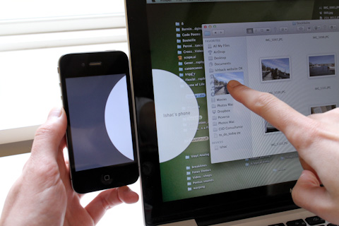
This weekend I wanted to transfer some articles I had in my web browser to my Kindle, to read them later. Just thinking about all the necessary procedures made me rule out the idea.

Despite how well virtually connected our devices are (iCloud, Dropbox, …), they still lack a tangible connection. A (representation of a) physical connection of those devices would facilitate a more intuitive interaction built on traditional mental models from the physical world. That’s one of the main reasons why kids interact with iPad so naturally, because it uses interfaces based on natural, tangible interactions.

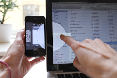
I tried to imagine how a more intuitive interaction would be while transferring media between devices, sketching it in a short video*:


The interaction feels natural, and provides a seamless transition while consuming media – in this case, listening to music from being in front of the computer to going mobile. It’s a more intuitive way to synchronize media across devices, and the ‘cloud’ would take care of the data transferring in the background (high res files, music that is not existing in your device yet, etc.)

Portable devices can locate other devices quite precisely on a large scale (using GPS, wifi triangulation, etc.) but in small spaces they only ‘sense’ the existence of other devices (bluetooth, local network) – neither the absolute nor relative position of other devices are being measured with precision enough to enable a physical connection beyond the cable.

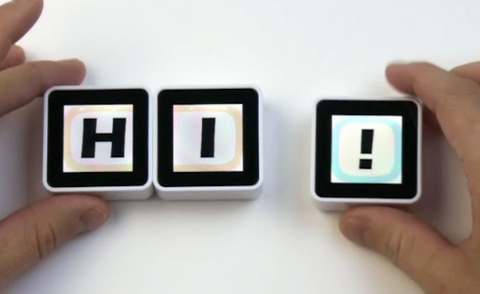
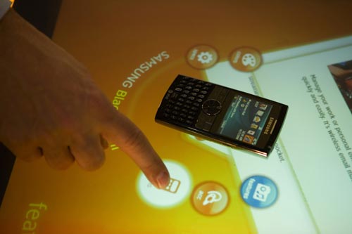
Some platforms use a physical connection using the device itself to create more intuitive ways to interact with them. Sifteo cubes use IrDA transceivers to detect other cubes nearby (<1cm). Microsoft Surface is using near-infrared light and cameras to detect objects sitting on the table. Last versions of Surface use PixelSense technology, being able to detect the object using micro sensors embedded on the screen pixel array.

Sifteo

Microsoft Surface

It seems that desktop and tablets are converging into a personal touch-screen device. Incorporating the technologies mentioned above on these devices would create a new canvas for exploring more natural ways of engaging with media on the tangible realm across multiple devices.


*The video sketch was done in a a few hours using the following tools:

– Keynote for the animations.

– Screenium for screencasting.

– iMovie for video editing.

– Freesound.org for the sound fx.

Mixing analog and digital techniques in photography post-production

March 18th, 2012 by ishback

Analog photography forced us to better understand the light and the physics behind photography, to better select the right moment to shoot, to better accept flaws as part of the captured moment. The fact of not being able to see the picture right after shooting, the ritual of bringing the roll film for development, having to wait some days and then, while browsing the photographs, making the connection to the moment they were shot… analog photography might not be convenient today, but it definitely has more magic than digital photography.

Likewise, digital post-processing is much easier and convenient than the analog process, but it lacks the same magic. The process of burning and dodging for example, isn’t it beautiful?

After watching this documentary (War Photographer, 2001, which I highly recommend) I wanted to try this process. Today it is not easy to access one of those labs, and each print, specially on this size, is quite expensive. I start thinking about how could I experience the process of manipulating the exposure as in the analog process, using more accessible means.

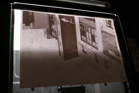
The analog dodging and burning process requires a light source, the negative of the picture, and the photographic paper to capture the projected light. A projector can substitute the light source + the film to project a picture, and a digital camera on long-exposure can substitute the photographic paper, to capture the projection. The exposure manipulation is the same in both methods, and definitely with more magic than the digital one.

I set up a room with the setup above (same as I used for Generative Photography experiments). To be aligned with the mix of analog and digital process I was about to try (camera and projector are digital, manipulation is analog), I decided to play with some pictures I took with my film camera. The pictures were developed using and A/D process, so I had them on my computer. The workflow then is the following:

First of all I made some tests to find the right settings for the camera and the projector, so the exposure as neutral as possible – the long-exposure picture of the projection (without manipulation) had similar exposure than the original.

I started playing with a picture of the sky, quite homogenous, in order to see how sensitive is the result to the manipulation. I used a circular tool, and a square one for big areas.

Trying to do some gradients, the first one is not quite smooth, the other two a bit better:

I was using 20 second exposures, and specially with the circular tool it was difficult to remember exactly which areas were already manipulated.

Combining the circular and square tool:

Then I used another picture to try a smooth gradient or to darken an area. Those some of the results:

I made some tests with this other picture, slightly overexposed in some areas:

Similar to what happens using the analog burning & dodging method, I didn’t have completely direct feedback about the manipulation, just what I could see on the small LCD screen of the camera. I thought it would be interesting to see the result on the screen, and be able to work on it right after. This way it would be an iterative process so I could manipulate small details in each iteration, that would be accumulated in each step. I used Processing to do the following steps:

1. Project the picture A

2. Open the shutter of the camera

3. (me) Manipulate the exposure

4. Close the shutter of the camera (after 20 seconds)

5. Send the recently taken picture A’ to the computer

6. Project the picture A’

7. (me) see the changes and analyze which area needs manipulation

(back to 2 and repeat)


The result was good in terms of the experience, being able to make small modification each time. The drawbacks were that there wasn’t a Ctrl+Z feature, and that it was extremely difficult to adjust the crop of the camera in order to keep the frame and aspect ratio of the picture. Actually after many tests I didn’t succeed – the width of the picture was diminishing at each iteration, while the contrast was increasing. This resulted in some freaky images:

Willing to do some other digital/analog post-processing with accessible tools, I tried to apply a texture to a picture. I printed a picture in a plain white paper, and I used a photocopier and my camera to capture the texture of the paper.

This is the original picture:

This is the result, texturized:

Another test with another picture:

It was fun but I still want to spend some time in the photography lab :)

I made a short video of two of the tests I made:

A little letterpress

November 26th, 2011 by ishback

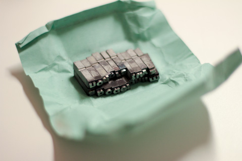
Some weeks ago Elena brought me a set of cast metal sorts from Italy, a gift from an old typographer. She knows I have a soft spot for typography, analog processes and old machinery: letterpress printing is a good example. I love all that stuff.

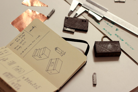
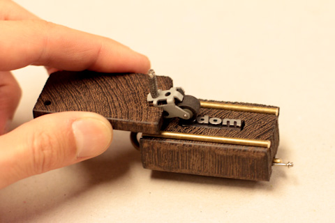
I decided to build a small letterpress so I could use the types. I checked which materials I had in my material box and I found some scraps from past experiments. Three blocks of wood (I’m pretty sure is Mahogany), brass little rods and some copper. These random pieces defined the shape of the little letterpress.


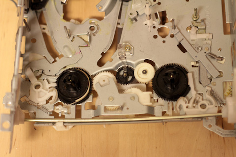
I made a little ink brayer with some parts of an old radio cassette player I found in the studio.

Despite typography and letterpress printing is everything about accuracy, I must say this is not the most precise letterpress ever. This type of wood is really hard and thin drills were bending. Also I couldn’t work with a precise router this time (I used a Dremel with the router table).

I made a little video of one of the first print tests:

Last weeks at CIID I’ve been involved mainly in research projects and mentoring the students on their final projects, not much hands-on prototyping. This little press project has balanced the thinking with some making.

There are some more pictures in my Flickr set.


I have a vision

November 13th, 2011 by ishback

A couple of weeks ago I watched the Microsoft’s future vision video, showing ‘How people will get things done at work, at home, and on the go, in 5-10 years’. Well, I hope they’re wrong because I don’t quite like what this future looks like. The whole video is an extrapolation of the power of technology to the future, brutally forced into everyday moments.

I’ve been working on projects that required making a video to show how a product or service would integrate on a future context. Sometimes is challenging to convey ideas without bending some of the features in order to make them understandable for everybody, using just audio and video. But there are ways to do it. In Microsoft’s video I don’t feel neither the concepts nor the representation of them are exactly on track.

I picked three moments that called my attention:

1. Is she using her glasses to translate the audio? I don’t think glasses are the best product to integrate such a feature. Solving an audio problem by putting a piece glass in front of your eyes when you don’t need it doesn’t sound appropriate. Wouldn’t be the phone a better option?

If the reason behind it is to make it discreet for other people and integrated in an object people usually wears, then I don’t understand the shining “translating” on the glasses arm which is seen only by people surrounding the user.

2. It scares me the amount of screens that will be surrounding people. Or people surrounding screens… But it feels the relationship between users, screens and context (which is what I’d like to know about the future) remains unclear. It’s even more confusing. Is all the information (work-related, personal, confidential) available from every screen? How is it filtered? By location, by people around the screen? Maybe it’s too risky to answer some of these questions on a visionary video.

Also I’m not sure why information is not confined within the screen frame anymore, and expands on walls and tables.

3. Do you really need to check the content of your fridge on a screen? Is it too much effort to just open the fridge?


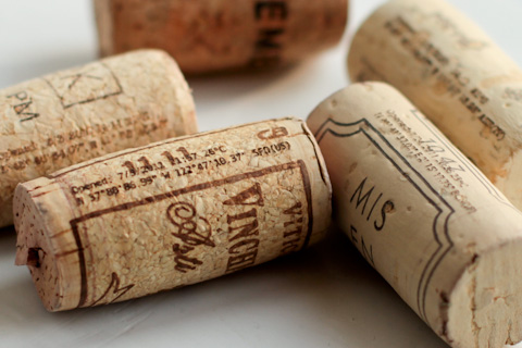
Anyway. This July I spent some days in California. One afternoon I was sitting with my friend Eric on a campsite near Yosemite. It was a place with great views, nice weather,  and the right time to open a bottle of wine. The cork popping sound is kind of iconic, and always helps celebrate a memorable event.

Then we imagined the cork was able to capture that moment. *Of course* technology would make it possible – this technology that will be everywhere, that will be very small, and very intelligent. With a pinch of irony, we imagined another example of what we might find around us in the future, specially if we follow certain future visions.

Take it lightly :)

Presenting… the e-Cork.

Creating music samples with vinyl records

August 18th, 2011 by ishback

Music sampling has been done for years using different techniques. Currently samplers (either as a piece of hardware or as software) is the most extended tool for playing samples that can come from digital formatted music, live recording, vinyls or tapes. One of the most old techniques for sampling was cut&paste the audio tape. I love this video from Delia Derbyshire using reel-to-reel recording, creating loops by cut&pasting the audio tape, and sync the samples to create music.

Driven by my devotion for vinyls and analog processes (perhaps a bit of Dj wannabe too), and emulating the audio tape cut&paste technique, I tried to make the vinyl sampling a bit more analog – literally cut and paste pieces of vinyl to create samples.

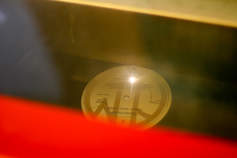
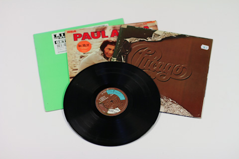
I bought some second hand vinyl records, different music styles: Supertramp, Wagner, Paul Anka, Chicago, Lil Jon and some random ones to make the first tests. I spend a couple of hours browsing and listening to old records – I remember thinking “all projects should start like this”.

Back to the studio, I considered different options to cut the vinyls – it had to be a clean cut in order to minimize the resulting groove and therefore the stress on the stylus.

I first used a hot wire cutter – it took some time to set the right temperature so the wire cut but didn’t deform the vinyl. It was quite important to keep a constant speed to avoid undesired melting too. I cut a small sector with the idea of reversing it afterwards, so a song from Side A would have a sample from a song from Side B.

The piece fitted quite well in its natural position but not in its reverse position. I had to smooth it out with a file, but there was already a serious gap and V-shape groove pretty difficult to resolve.

So I jumped into the second attempt, using a blade. It took around 50 passes to cut one straight line.

I cut a radial sector, it was slightly better than the first trial (no melted material) but I had to remove a burr with a file and again, it created a tiny gap, big enough to scare the stylus.

Then I tried the laser cutter and things went better.

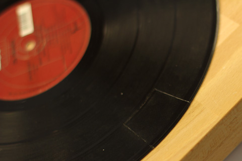
I made many tests to find the right laser power in order to get the cleanest cut possible. The best setting was to let the laser go through *almost* through the vinyl, and then crack manually the last thin layer (1). If the laser goes all the way through, it melts too much material and leaves a gap (2). If the laser doesn’t go enough deep, it’s pretty much impossible to take the piece out without creating an undesired crack (3).

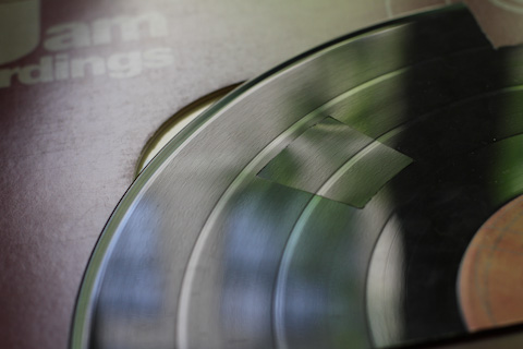
Even if the laser is well calibrated, it always cuts creating a cone-shape cut. Using the first option the crack doesn’t take out any material or creates burrs on the bottom surface, so that surface is the one I used for playing the record afterwards. The top one always have a gap where the stylus would go in.

I made some tests with different sectors to analyze repeatability and the cut wasn’t totally consistent on different positions of the disc and even on different positions of a sector. I think it’s due to the difference in resolution of the laser head depending of the combinations of X and Y axis speeds.

These are sectors from the same record, already exchanged, seen from the laser cut side:

And this is seen from the bottom side, where the final layer is cracked. Aligning the surfaces properly the gap is almost not perceptible by the finger:

The first time I placed the record on the vinyl player for testing, I noticed that the sectors were too small and it was difficult to guess which sample was it. The transition wasn’t clean – when the stylus found the groove it created a low sound (similar than a bass drum).

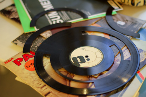
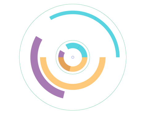
I decided to cut larger sectors on different records and exchange them to create loops or tunes using samples from different albums. I cut these patterns:

I cut the same angle in the label area so after the sectors were exchanged, I can remember which samples contain every record.


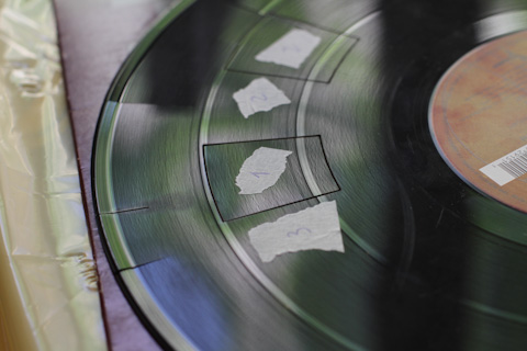
I exchanged the sectors from 4 different records: Paul Anka, Supertramp, Lil Jon and Chicago. I selected these four from the once I bought since they have the same thickness (1,2mm). The pieces snapped pretty well on its new position but I secured them temporarily with tape, so I could adjust the height and make the surface as even as possible before playing the record.


This are some of the resulting albums:

I made a video containing part of the process and the result, playing the records in a vinyl player.

It’s possible to hear (and see) the the stylus jumping a little bit – that’s not good for the needle. However this bumps create a new beat over the unmatching beats of the two samples, and that helps to define a new rhythm. I thought about selecting specific samples and make them match perfectly but that would work only for one rotation, so it might be good for scratching but not for listening continuously – it’s quite difficult to find records that the beat corresponds with a revolution.

It’s been an interesting experiment with a really fun process. I knew it would be, having vinyls, music and lasers involved :)